Designing a color palette - for developers
I'm currently watching Sarah Drasner's "Design for Developers" course on FrontendMasters. I'm also currently redesigning and rebuilding my portfolio website. Suitably enough, the design course has a chapter on color, color theory and how to build your own color palette.
Sarah Drasner introduced quite a few online tools to find or create color palettes. I already had a color i liked, so i used that as the basis. That's probably a good way to start. Fokus on chosing one color first and go on from there.
Since i had my base and primary color, I used color.adobe.com and picked the complementary set. I entered my 1st color and let the tool find the complementary colors. Using the complementary set is a recommendation by Sarah Drasner since for web design you probably want one color to draw attention to certain selected areas of your website. If i understood correctly, a complementary color palette is a "you can't do much wrong" decision here.
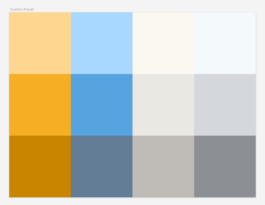
The adobe tool only gives out 5 colors. In the course, though, Sarah Drasner designed a color palette with 6 colors, 3 nuances for the brand or primary color, 3 nuances for the accent or secondary color. 6 colors is also what i found a good variety while implementing web designs over the past years.
Step 1: A color tool for the colors
On color.adobe.com, I entered the 1st color, my base primary color, an orange. I switched to HSL mode in the adobe tool.
The brighter nuance of that primary was a bit too bright for me. So i gave it a stronger saturation. The darker nuance was already pretty good.
The accent colors (blue) were both a little bright, especially the brighter nuance. It felt like it would stick out too much, hurt the eye and kinda fight against the primary colors. I wanted a more faint, matt version of them. So i played around with the saturation and brightness (never touching the hue) until i got a result that was still bright enough, yet pleasant to the (or my) eyes.
Step 2: A design tool for the greys
Then i opened a design tool, in my case sketch. I had my file with designs for my portfolio site and in one corner, i added a small artboard, 200x600, so it can fit 12 rectangles each 100x100. I added all the colors. Played a bit more, to get a 3rd nuance for my accent colors (remember, adobe only provides 5 colors). And then i copied all 6 colors and created my grey nuances from it.
This part kinda blew my mind. Sarah Drasner started out the Color chapter by explaining color theory and the various color modes: hex, rgb, and hsl. Besides finally understanding hsl well enough to be able and play with it, it came in very handy for creating the grey nuances. What she did was: Use each color and remove the saturation, or go very low with it. I went for a saturation of 4-5 while keeping the same level of brightness for each color.
Et voilà: Here's the color palette for my upcoming portfolio redesign cum refactor.
Horay \o/
(Yes, you could do the grey part also in the online tool. But then i wouldn't have practiced this awesome tip.)